It's not often that your own design studio decides to rebrand. We'd spent years telling clients their brand was their most valuable asset, yet ours had been running on intuition rather than a documented strategy. What came next was not a rebuild from zero, but an evolution of what worked and refinement of the rest.

Project Overview
Setting the lens on ourselves, we realized we had elements of a brand identity but needed a complete, cohesive brand system, along with a website that reflected our strategic, brand-first approach that had evolved over time. The project centered on building a refined visual identity and a website build that simplified the user journey and presented our studio's services in a way that explained what made our deep discovery process unique and valuable.
Challenge
The previous website lacked structure and real content around The Durkan Group's services, making it difficult for visitors to understand what we actually offered. The website challenge was to build a clear content hierarchy, improve navigation, and design an experience that felt professional without sacrificing personality.


Favorite Bits //
These are the delightful moments of the project that make it special
(01) Elevation of the Existing Tagline
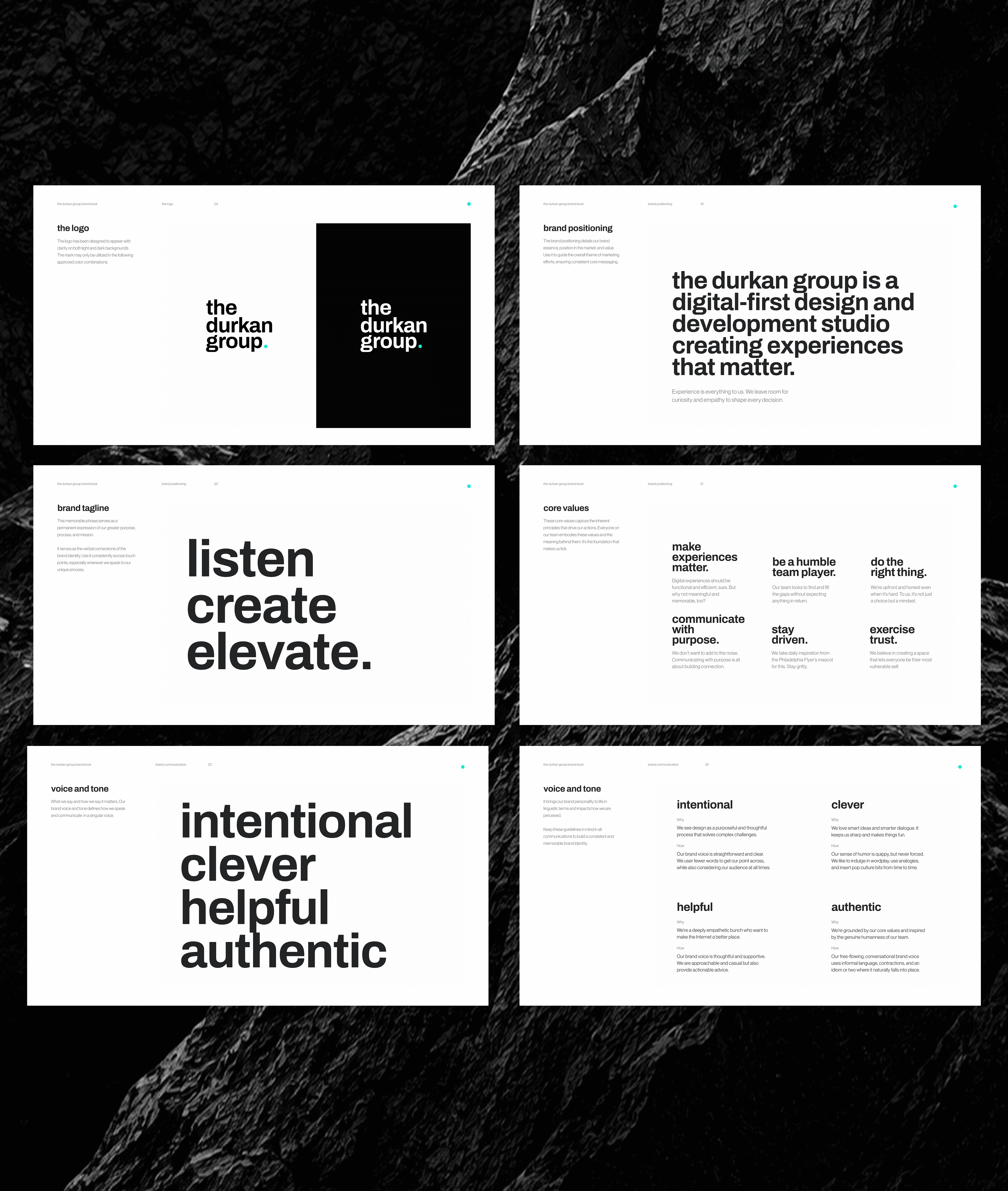
Listen. Create. Elevate. had always carried the studio's values, but the redesign extended its purpose. It turned the tagline into the architecture for how the Process page walks a user through the studio's approach, from discovery, design, and development to the support that carries a project past launch. Structuring the process around these three phases gives the tagline new depth. It also addressed the lack of services content on the prior site with a clear hierarchy that shows users not just the studio's capabilities, but how each part of that offering actually comes together.
(02) A Human Brand Voice
Crafting the brand voice meant distilling the studio's personality, values, and perspective into a singular way of communicating. It needed to exude technical credibility and genuine warmth, so the voice was centered around four pillars: intentional, clever, helpful, and authentic. This brand voice is concise but also witty without being forced. It uses a tone that stays casual while always resolving into something actionable, and a free-flowing use of contractions and idioms reads like a person talking rather than a brand performing. Together, this gives the studio a single, recognizable way of speaking: confident without tipping into cold, and clever without undercutting the substance of the work.
(04) Surpise and Delight
Small details do a lot of work when it comes to signaling personality. An emoji trail follows your cursor through the Thoughts hero section. Every contributor byline carries its own hand-picked emoji instead of a stock avatar. Team photos are featured throughout the site, but there's no wall of stale headshots and bios. The studio reads as a collective rather than an org chart, so people show up inside the work itself instead of in a directory. These playful touches reward users for exploring the site, not just skimming it.


